UX audit
— Usability & functionality baseline: 3.3 / 5
— Overall UX below expectations
— Mapped friction across chats, calls, and navigation
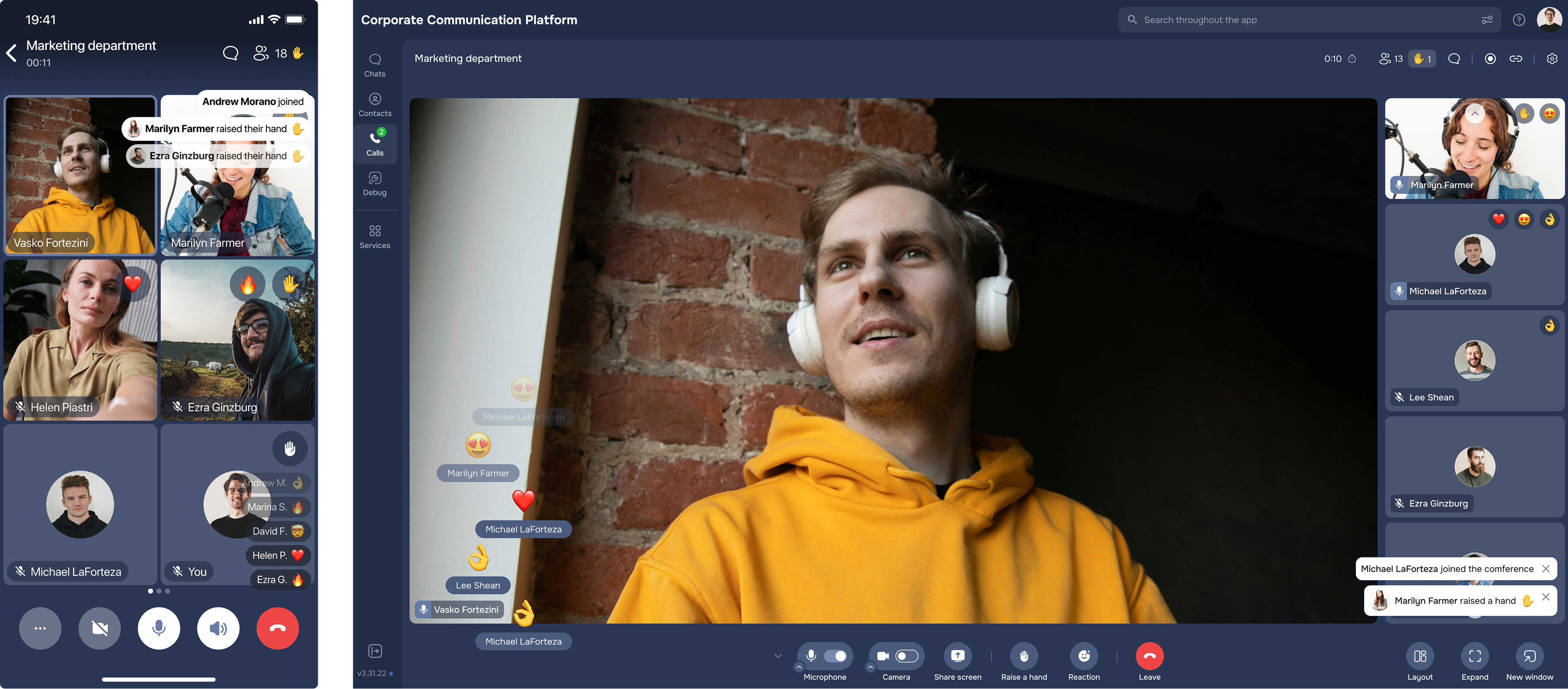
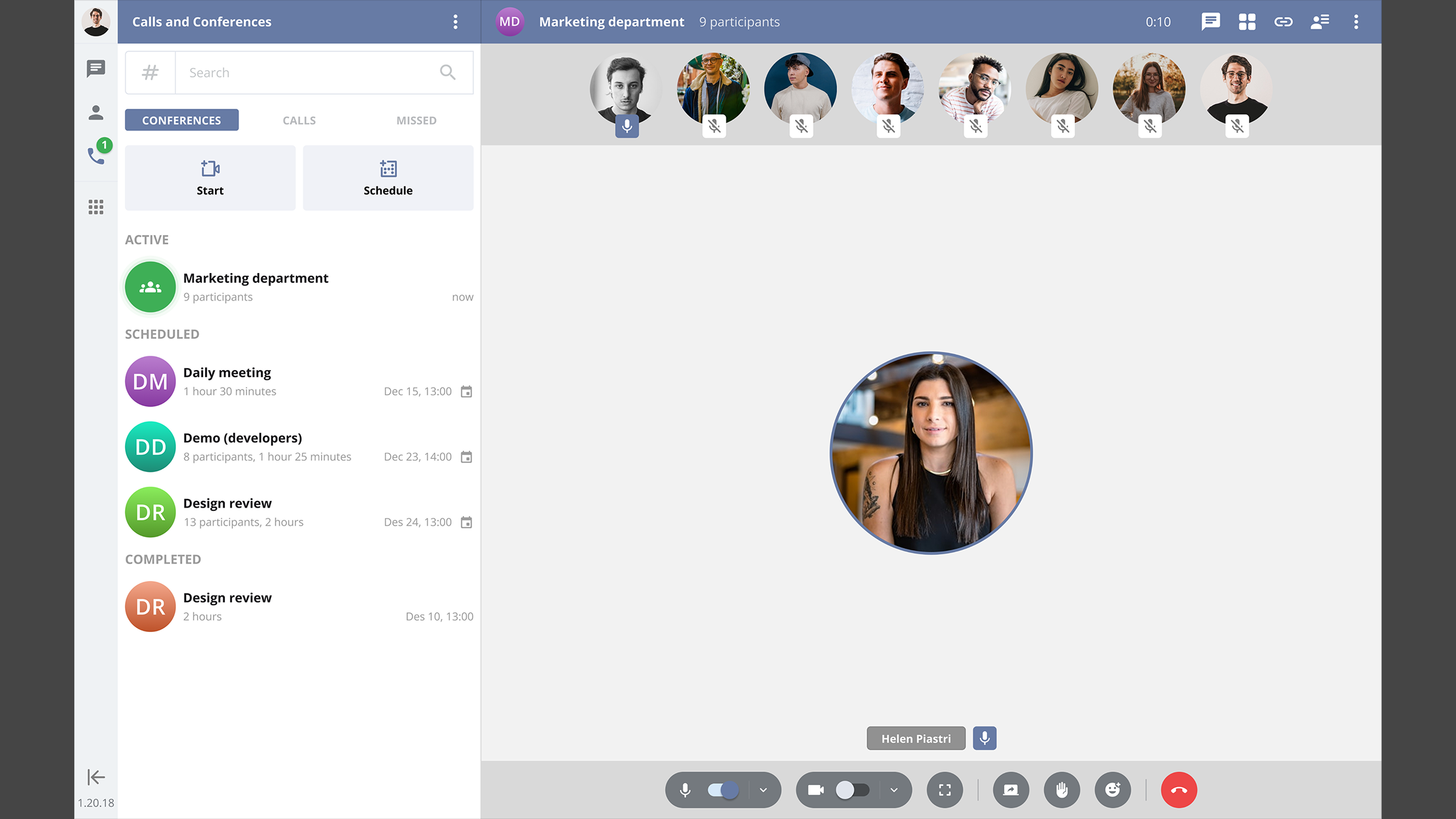
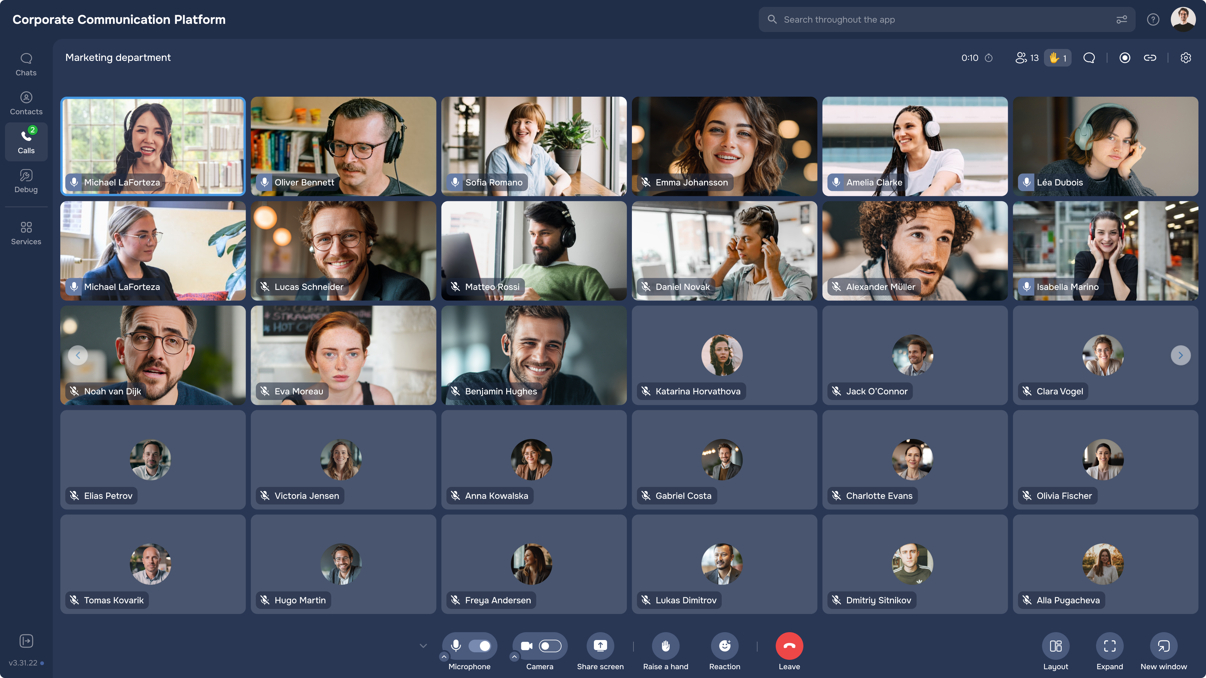
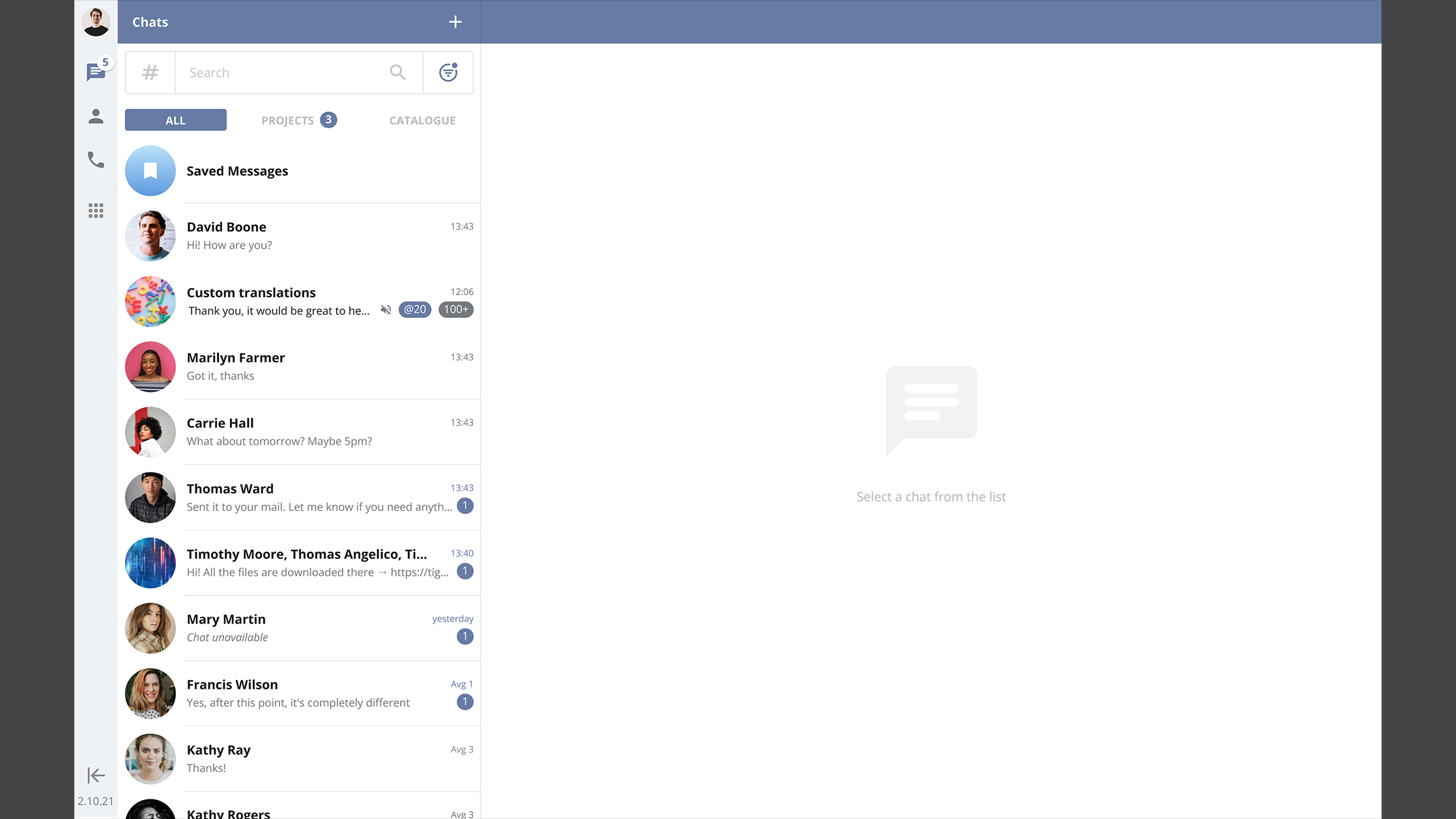
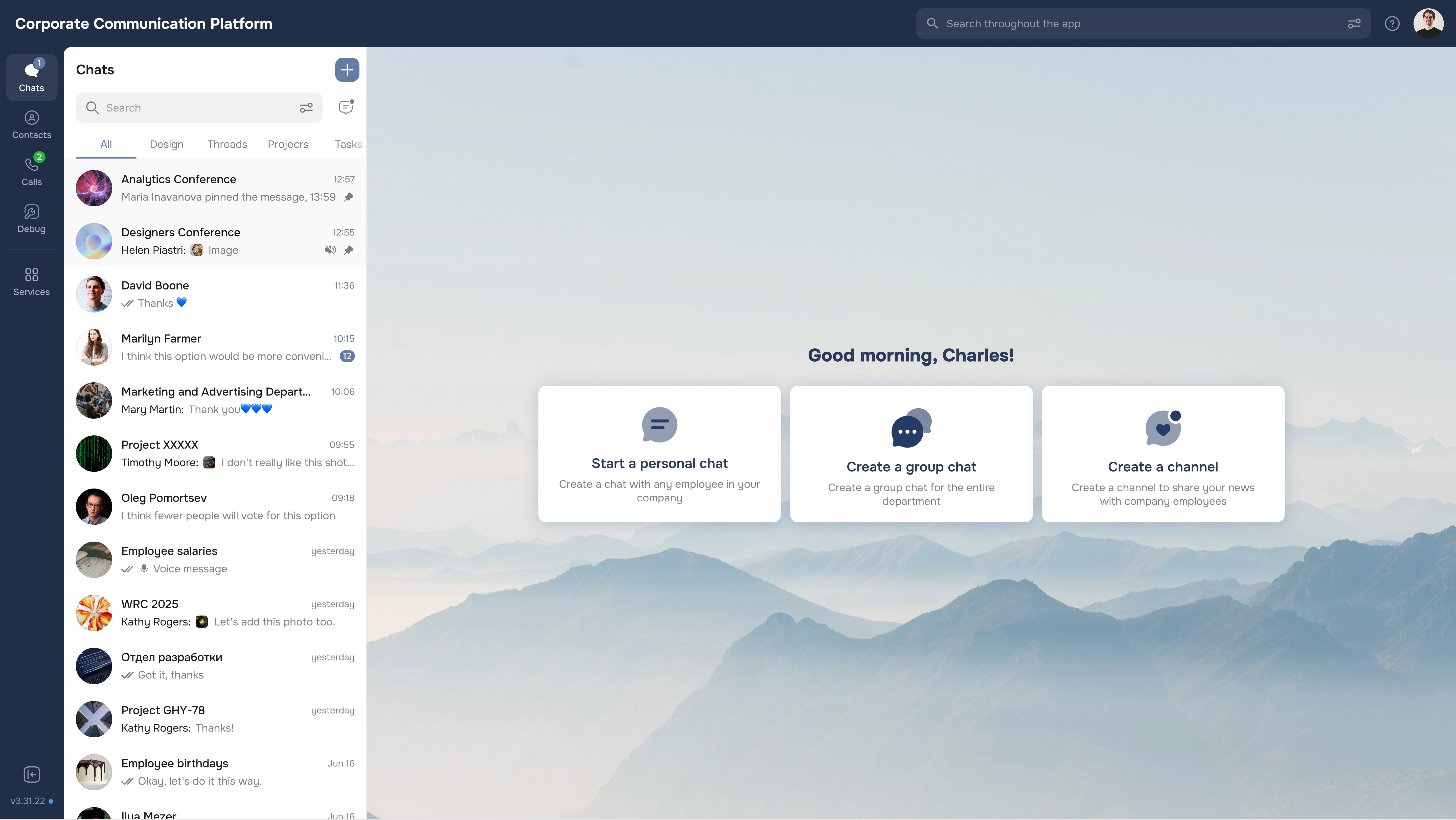
eXpress is a secure, large-scale enterprise communication platform with encrypted messaging, audio/video calls, and collaboration tools.
I led the redesign of an enterprise communication platform with messaging, calls, and collaboration tools used by 2M+ users.
Over time, the product accumulated inconsistent UI patterns and increasingly complex navigation, making core workflows harder to use. My goal was not just a visual refresh, but structural clarity — simplifying key flows, reducing cognitive load, improving accessibility, and establishing a scalable design system to support faster, more consistent delivery across teams.
While the platform was functionally robust, everyday interactions required too many steps and key actions were difficult to discover. Patterns diverged across modules, and new features blended into an already overloaded interface.
As a result, users spent time searching instead of communicating, feature adoption slowed, and the overall experience felt heavier than necessary.
To identify key friction points, I combined a UX audit with scaled user feedback (surveys + interviews) and validated solutions through iterative prototyping and usability testing.
— Usability & functionality baseline: 3.3 / 5
— Overall UX below expectations
— Mapped friction across chats, calls, and navigation
“Our goal is to attract as many large clients as possible.”
“I spend more time searching for chats than using them.”
— Concept directions (layout, IA, features)
— Low → high fidelity prototypes
— Iterative feedback with PMs, Devs, and analysts
— Task-based testing on interactive prototypes
— Behavioral observation + think-aloud
— Post-test metrics (SUS, NPS)
After identifying friction in core journeys, I proposed a structural improvement of navigation and information architecture. Together with the PM, we aligned on key success metrics, and with developers, we validated constraints before reshaping the navigation model. A simplified structure was implemented that prioritised high-frequency actions and reduced unnecessary steps across chats and calls. Throughout the process, our goal was to balance feature visibility with interface simplicity to reduce cognitive load.
Based on research insights, I proposed introducing lightweight personalisation to support different user workflows better. I designed contextual onboarding flows using progressive disclosure, so features were introduced at the right moment rather than discovered accidentally. The approach was refined through usability testing before implementation.
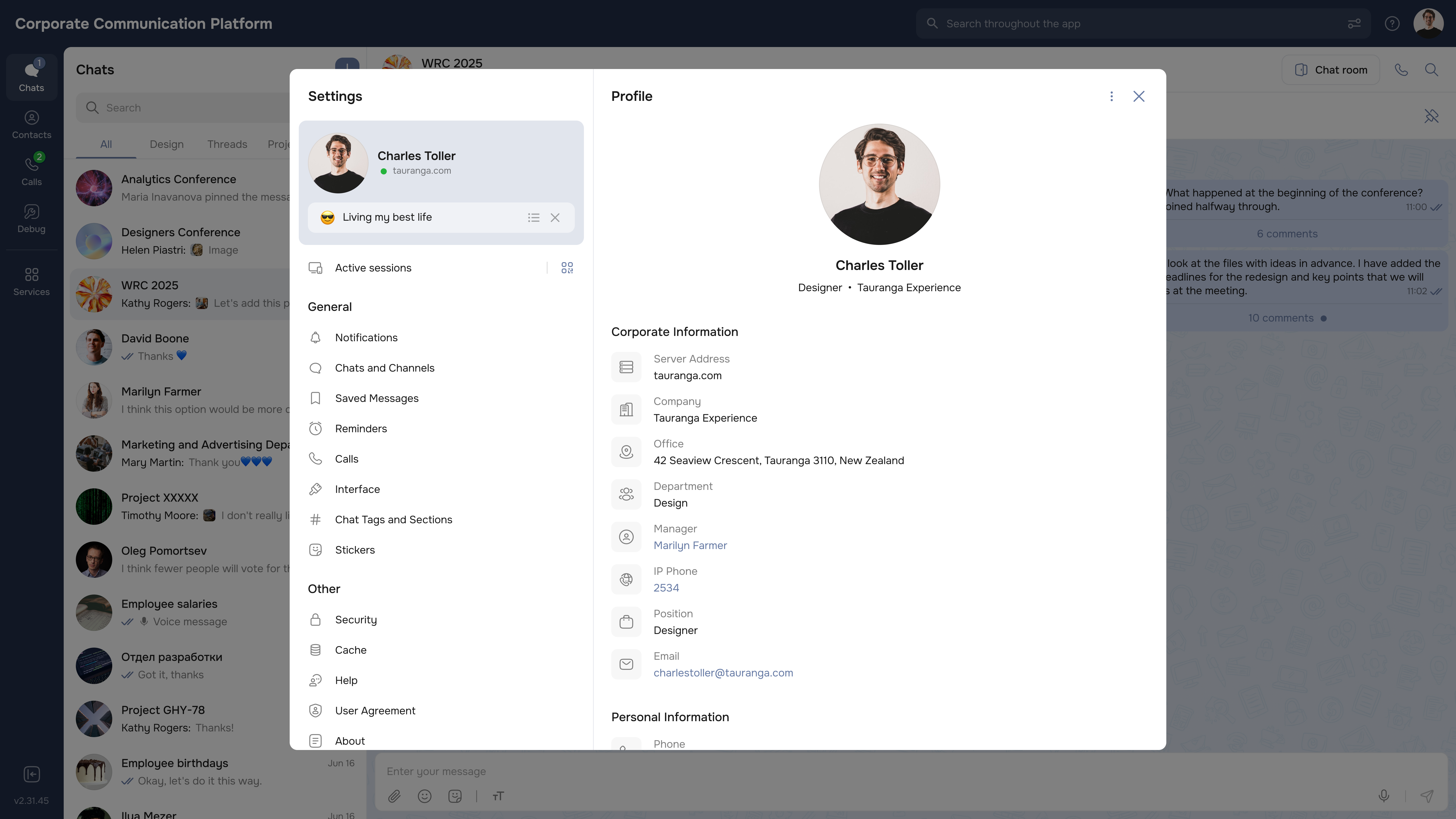
As inconsistencies across modules became more visible, my team and I initiated a UI audit and worked closely with developers to align on component behaviour and edge cases. I co-built and documented a unified design system in Figma, creating reusable patterns that improved consistency and made future delivery faster and more predictable.
After rollout, we tracked usability outcomes and sentiment shifts. The biggest win was making everyday actions faster and more predictable — especially for chats, calls, and navigation.
This project wasn’t about “redesigning everything”. The real work was making daily actions predictable — so people could move between chats, calls, and contexts without friction.
If I had more time, I’d keep expanding design system coverage and validate discoverability for cross-platform flows — especially for new users.